
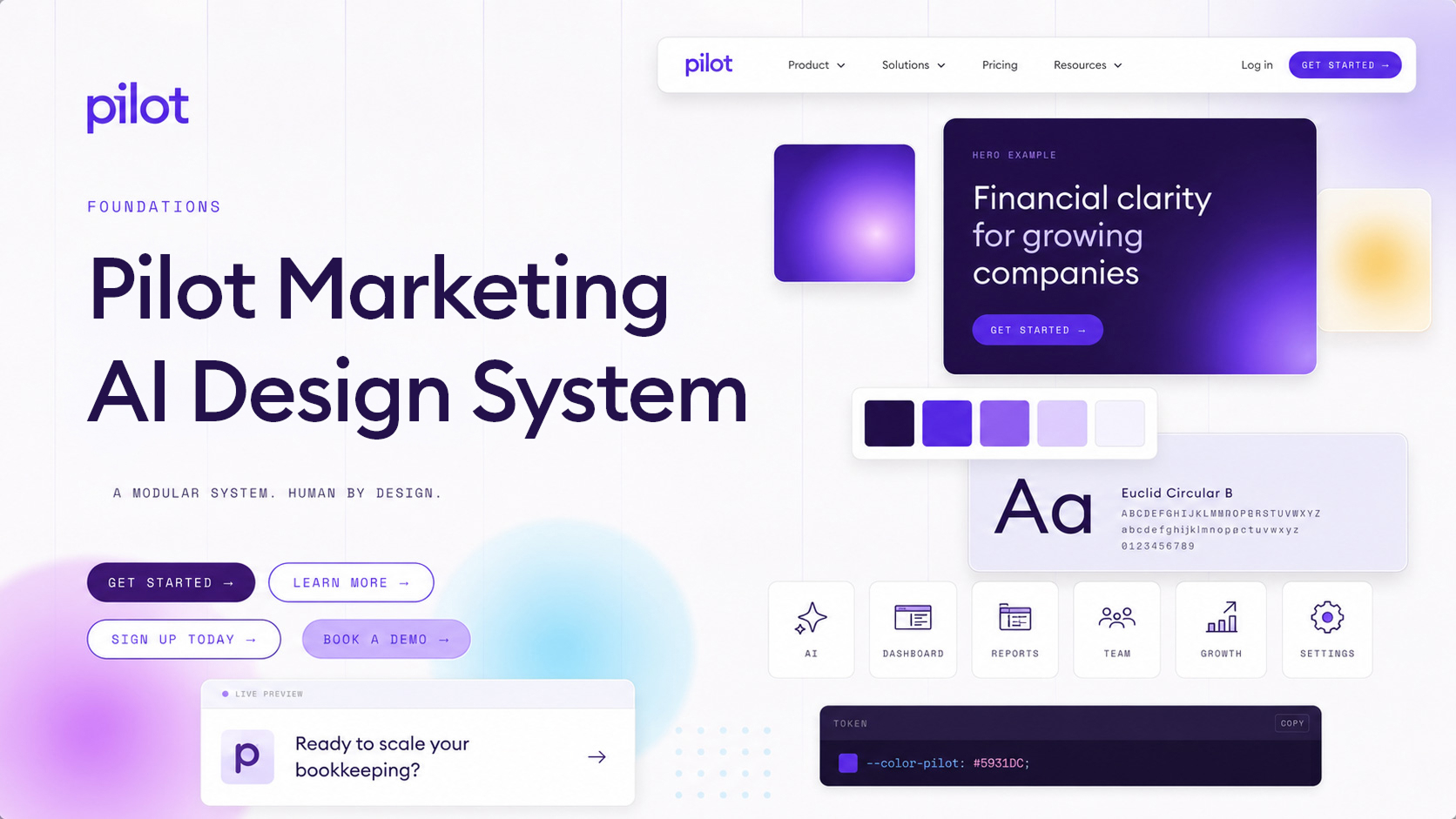
Quick Reference
Essential values at a glance.
| Category | Value |
|---|---|
| Source of truth | Design system markdown file |
| Website | Pilot.com |
| Primary color | #5931DC — PILOT purple |
| Body font | Euclid Circular B — geometric, warm, weights 300–700 |
| Tech font | Space Mono — labels, buttons, eyebrows (use sparingly) |
| Human accent font | La Belle Aurore — ≤4 words, never a crutch |
| CTA border-radius | 999px — always full pill |
| Text alignment | Left-align default — center permitted for exceptions |
| Drop shadow color | Purple family only · blur 50–100px · opacity 10–20% |
| Container max-width | 75.5rem (1208px) · 40px h-padding |
| Section padding | 120px vertical (standard) · 7.5rem hero |
| Base text color | #3f3c3d |
| Platform | Webflow + custom CSS · Marketo forms · Swiper.js · GSAP 3 |
How to Use
Use the Pilot marketing AI design system with your favorite AI vibe coding tool. It includes definitions, brand guidelines, fonts, icons, and logos. You can build marketing websites, decks, assets, ad creative, landing pages, micro-sites, and more!
- Design with Claude Code or Antigravity IDE.
- Clone the design system repo: github.com/Pilot-Design-Team/design-pilot-com
- Commit and push the changes to GitHub.
- Publish the project to Vercel.
Use the Pilot design system. Clone the repo https://github.com/Pilot-Design-Team/design-pilot-com and review ReadMe.md before starting. When I prompt you to build, use only the existing patterns, components, layouts, and visual treatments in the design system. Do not create new UI patterns, components, layouts, or visual treatments. Follow the structure, behavior, and visual language already established.
Brand Philosophy: People & Tech Spectrum
Pilot is 50% people, 50% tech. But this ratio shifts depending on the context. Match all visual choices — photography, type, backgrounds — to where the feature sits on this spectrum.
photos · La Belle Aurore · warmth HALF & HALF MORE SOFTWARE
product UI · Space Mono · data
| Situation | Ratio | Visual Direction |
|---|---|---|
| CFOs building a financial model | 80% People | Photography, La Belle Aurore, warm backgrounds |
| Day-to-day bookkeeping | 50 / 50 | Balance product UI + human imagery |
| AI accounting offering | 80% Tech | Product screenshots, data visuals, Space Mono, grid backgrounds |
DesignSystem.md
DownloadThis design system Markdown file is the source of truth for agents and humans and contains everything you need to know about the pilot marketing AI design system.
Color Palette
Named colors are the official brand language. Purple scale: deep (loud, certain) → light (calm, trust). Secondary spread colors pair with purple — subdued tones are standard; "+" variants for accents only. Click any swatch to copy the hex.
Typography
Three fonts. Each carries meaning. Euclid Circular B is the default for everything. Space Mono signals tech. La Belle Aurore signals human warmth — use it sparingly, never more than 4 words.
| Rule | |
|---|---|
| ✓ | We default to left-aligned text. Text can be centered for section headings, pricing, and CTA blocks. |
| ✗ | Text should never be right-aligned. |
600 (SemiBold) is Pilot's primary emphasis weight — it carries all headings, section titles, stats, and CTA labels. 700 (Bold) is never used for headings.
| Weight | Role | Frequency |
|---|---|---|
300 |
Light / modifier text in mixed-weight headlines (Euclid Light) — migrate to 400 | Legacy |
400 |
Body copy, paragraphs, form labels, nav links | Standard |
500 |
Mid-emphasis (utility classes only) — migrate to 600 | Legacy |
600 |
All headings, section titles, stats, nav active, pricing, CTAs | Primary |
700 |
Inline <strong> / bold spans only — never for headings |
Low |
900 |
Avoid — almost never used | Avoid |
Financial clarity for growing companies
Euclid Circular B · SemiBold 600Financial clarity for growing companies
700 is too heavy for Pilot headingsOur Platform
The AI accountant that works
alongside your team
not against it
Strata handles the full scope of bookkeeping autonomously, from transaction categorization to financial statement production. Your team stays in control while AI does the repetitive work.
Font sizes are organized into semantic tiers. Pick the right tier for your content type; the exact size within a tier depends on context and emphasis.
| Size | px | Line Height | Notes |
|---|---|---|---|
4.5rem | 72 | — | Maximum display |
4rem | 64 | 120% | XL stat numbers |
3.75rem | 60 | 107% | Hero headlines |
3rem | 48 | 115% | Standard H1 |
| Size | px | Line Height | Notes |
|---|---|---|---|
2.5rem | 40 | 115% | Section headings (H2) |
2rem | 32 | 125% | Card titles (H3) |
1.75rem | 28 | — | Subsection headers |
1.5rem | 24 | 125% | Small headers (H4) |
| Size | px | Line Height | Notes |
|---|---|---|---|
1.375rem | 22 | 1.9rem | Feature descriptions |
1.25rem | 20 | 1.875rem | Large body / footer titles |
1.125rem | 18 | 1.9rem | Hero form inputs |
| Size | px | Line Height | Notes |
|---|---|---|---|
1rem | 16 | 1.5–1.75rem | Default body |
0.9rem | 14.4 | — | Compact body |
0.875rem | 14 | 135% | Small body / meta |
| Size | px | Line Height | Notes |
|---|---|---|---|
0.8125rem | 13 | 135% | Fine print, footer legal |
0.8rem | 12.8 | 120% | Inline labels |
0.75rem | 12 | — | Eyebrow text, small caps |
| Element | Size | Weight | Line Height |
|---|---|---|---|
h1 Display |
3rem (48px) |
600 |
115% |
h2 Section |
2.5rem (40px) |
600 |
115% |
h3 Card header |
2rem (32px) |
600 |
125% |
h4 |
1.5rem (24px) |
600 |
125% |
| Body | 1rem (16px) |
400 |
1.75rem (28px) |
| Eyebrow | 0.75rem (12px) |
400 |
— |
| Cursive accent | 2.5rem (40px) |
400 |
1 |
Our Services
Financial clarity for small businesses
| Value | Usage |
|---|---|
-0.03em (-0.48px) |
Cursive accent text, slide CTA buttons |
-0.01em (-0.16px) |
Tight headings |
0.075em (1.2px) |
Eyebrow labels (uppercase) |
0.12em (1.92px) |
Uppercase labels |
0.125em (2px) |
Button text (uppercase) |
0.15em (2.4px) |
Wide caps, announcements |
Spacing & Layout
Container widths, section padding, and grid patterns used across pilot.com.
10rem (160px) — Large section gap (top)
7.5rem (120px) — Standard section padding (top/bottom)
5rem (80px) — Footer top padding
3.75rem (60px) — Column gap (pricing)
3rem (48px) — Footer column gap
2.5rem (40px) — Card padding (standard)
1rem (16px) — Default grid gap
| Class | Max Width | H-Padding |
|---|---|---|
.container Canonical |
75.5rem (1208px) — Standard |
40px |
.container-narrow Canonical |
60rem (960px) |
40px |
.container-narrow Legacy |
856px |
40px |
.container-narrower Legacy |
766px |
40px |
.container-max-85rem Legacy |
1360px |
— |
.container-max-80rem Legacy |
1280px |
— |
| Class | Columns | Gap |
|---|---|---|
.grid-2col |
1fr 1fr |
3.75rem |
.grid-3-col |
1fr 1fr 1fr |
16px |
.grid__4 |
1fr 1fr 1fr 1fr |
— |
.grid-5-col |
1fr×5 |
16px |
.footer-grid |
1fr×5 |
3rem |
.pricing-columns |
1fr 1fr |
40px |
| Name | Query | Behavior |
|---|---|---|
| Mobile | max-width: 479px |
Single column, stacked layout |
| Tablet | max-width: 767px |
2-column, simplified nav |
| Webflow collapse | 768px |
Mobile hamburger menu activates |
| Desktop | min-width: 1281px |
Full nav with adjusted container padding |
| Large | min-width: 1900px |
Hero image shadow hidden |
Gradients
Gradients suggest transformation — moving from one state to another. Because the brand is rigidly accurate, gradients reintroduce human nature: sunlight, depth, a world outside the spreadsheet.
Multi-directional
Ambient gradients using blurred orbes.
Grids and Shapes
Content lives inside fixed-width containers and uses blessed grid ratios that map to a 12-column design grid. Circles add structure and warmth — but only when they earn their place.
The underlying design grid is 12 columns. In CSS, content uses fr units that map to specific column spans. Only these blessed ratios are permitted.
1.25fr, 55% 45%) are technical debt and must be migrated to a blessed ratio.
| Ratio | 12-Col Spans | CSS | Visual |
|---|---|---|---|
| 1 : 1 | 6 + 6 | 1fr 1fr |
|
| 1 : 2 | 4 + 8 | 1fr 2fr |
|
| 2 : 1 | 8 + 4 | 2fr 1fr |
|
| 1 : 3 | 3 + 9 | 1fr 3fr |
|
| 3 : 1 | 9 + 3 | 3fr 1fr |
|
| 1 : 1 : 1 | 4 + 4 + 4 | 1fr 1fr 1fr |
|
| 1 : 1 : 1 : 1 | 3 + 3 + 3 + 3 | 1fr 1fr 1fr 1fr |
|
| 1×5 | — | 1fr 1fr 1fr 1fr 1fr |
|
| Full | 12 | 1fr |
| Container | Max Width | H-Padding | Usage |
|---|---|---|---|
Standard |
75.5rem (1208px) |
2.5rem (40px) |
Default page container |
Narrow |
60rem (960px) |
2.5rem (40px) |
Text-heavy, focused content |
Pilot uses thin intersecting lines — not explicit card containers — as the primary way to separate grid content. Lines create structure without the visual weight of bordered cards.
| Pattern | When to Use | CSS |
|---|---|---|
| Pin lines | Team profiles, feature comparisons, pricing columns, any repeating content within a shared context | border-right: 1px solid #e0e0e0 |
| Row dividers | Stacked rows within a section (FAQ, feature lists, table-like layouts) | border-bottom: 1px solid #e0e0e0 |
| Cards | Only when content needs visual elevation — distinct background, shadow, or clickable surface | Canonical card classes |
border-radius:50% with equal W×H or
aspect-ratio:1. Do not fill with PROFIT (#281350) — it reads as a void, not an
anchor.
(ambient)
Section divider — 1px #e0e0e0
Eyebrow left-border accent
Intersecting lines (infographic framing)
Corners & Border Radius
Traditional finance = rigid spreadsheets. We deliberately round corners to varying degrees to make the brand feel approachable. CTAs are always full pills.
0pxNone
4pxCheckboxes
8pxCards
16pxFeatured cards
32pxData boxes
(30–40px range)
56pxHero form
999pxCTA pill
(always)
| Element | Radius | Notes |
|---|---|---|
| CTA Buttons | 999px |
Always full pill. Gradient stroke/glow optional for emphasis. |
| Name cards, data boxes | 30–40px |
Use Figma Scale function when resizing to preserve rounding. |
| Chat bubbles | iPhone-style | Mimic iOS native message bubble — their own design language. |
| Standard cards | 8px |
Light rounding for data/content cards. |
| Featured cards | 16px |
More prominent rounding. |
| Hero email form | 3.5rem (56px) |
Email capture wrapper. |
| Pricing tabs | 60px |
Pill-shaped tab switcher. |
Buttons
All CTAs are pills (999px radius). Font: Space Mono, uppercase. Always a purple. Can have a light gradient stroke or glow ring for emphasis. Transition: all 0.2s.
On light background
On dark background
| Variant | Background | Border | Text |
|---|---|---|---|
| Primary filled | #5931DC |
None | White · Space Mono · uppercase |
| Glow emphasis | #5931DC |
Glow ring rgba(89,49,220,.2) |
White · Space Mono |
| Outlined | Transparent | 1.5px solid #5931DC |
#5931DC |
| Dark filled | #281350 |
None | White · Space Mono |
| White outlined | Transparent | 1.5px solid white |
White (for dark backgrounds) |
Form Fields
Clean, minimal. Input border is 1px #e0e0e0 turning purple on hover/focus. Hero form uses a pill container (3.5rem radius). Focus ring: 3px rgba(89,49,220,.08).
Hero email capture (pill form)
/* Standard input / select */
input, select {
  border: 1px solid #e0e0e0;
  border-radius: 3px;
  font-size: 16px;
  min-height: 52px;
  padding: 12px 16px;
  transition: border 0.2s;
}
input:hover  { border-color: #5931DC; }
input:focus  {
  border-color: #5931DC;
  box-shadow: 0 0 0 3px rgba(89,49,220,.08);
  outline: none;
}
Cards
Three canonical card variants for new implementations. Default to pin lines for separating content — only use cards when content needs elevation, a distinct background, or is a clickable surface.
.card-large, .card-small, .promo-card, .story-card, .card-gray, .testimonial-card) are technical debt — migrate to a canonical variant.
White Card
Default card for general content. Radius: 0.5rem, padding: 4rem.
White Shadow Card
Elevated or featured items. Purple subtle shadow.
Ready to scale your bookkeeping?
Expert financial management — powered by people and technology.
| Card | Background | Radius | Shadow |
|---|---|---|---|
.card-white |
White | 0.5rem |
None |
.card-white-shadow |
White | 0.75rem |
Purple subtle |
.blog-card |
Image + Text | 0.625rem |
Standard |
| Legacy Class | Issue | Migrate To |
|---|---|---|
.card-large |
No radius, 3.75rem padding | .card-white |
.card-small |
4px radius, gray border | .card-white or .card-white-shadow |
.promo-card |
10px radius, gray shadow | .card-white-shadow |
.story-card |
5px radius, gray shadow | .card-white-shadow |
Drop Shadows
Only for complex graphics incorporating name tags, layered product snapshots, or icons. Subtle shadows add depth and clarify composition.
Decorative Patterns
Patterns foreshadow what customers see in the product. Four types — all using the purple color family. These are overlays, not backgrounds. They layer on top of section background colors to add visual texture.
Patterns are never used on their own — they sit on top of a section background color. The pattern opacity is tuned for the purple family, so they work best on dark sections (Profit, Deep Purple) and neutral light sections.
| Section Background | Pattern Works? | Notes |
|---|---|---|
| Profit (#281350) | Best | Primary use case — CTA blocks, heroes. Patterns add depth to dark purple. |
| Deep Purple (#3c2d89) | Good | Works well, especially Ledger and Highlighted Cells. |
| White / Gray | Subtle | Very faint — use only when you need just a hint of texture. |
| Warm / Cool tints | Avoid | Purple patterns clash with non-purple tinted backgrounds. |
rgba(89,49,220,...) — the same purple base as PILOT. Adjust opacity to suit: 0.08–0.12 for light backgrounds, 0.12–0.20 for dark backgrounds.
/* Ledger grid */
.bg-ledger {
  background-image:
    linear-gradient(to right, rgba(89,49,220,.08) 1px, transparent 1px),
    linear-gradient(to bottom, rgba(89,49,220,.08) 1px, transparent 1px);
  background-size: 40px 24px;
}

/* Dot matrix */
.bg-dots {
  background-image: radial-gradient(circle, rgba(89,49,220,.2) 1.5px, transparent 1.5px);
  background-size: 12px 12px;
}
Section Background Colors
Section backgrounds create visual rhythm and signal content tone. Background color choice is not decorative — it follows the warm↔cool spectrum used for photography and visual direction.
Background tints map to where content sits on the people↔software spectrum:
people · relationships NEUTRAL
balanced COOL
tech · software · data
| Position | Tint | Color | Signal | Use When |
|---|---|---|---|---|
| Warm | Access | Human, relationships, SMB | Testimonials, team, founder stories, SMB content | |
| Neutral | Clarity | Balanced, brand-neutral | General features, balanced product + people | |
| Neutral | Highlight | Curiosity, exploration | Product walkthroughs, "what's changed" moments | |
| Cool | Trust | Tech, software, data | Platform demos, AI features, startup content |
#DECEFF) carries special meaning from the Pilot product — it signals "something changed, take a look." Intentionally neither red nor green, it invites exploration without alarm.
Only these colors may be used as full-section backgrounds. All other colors are restricted to accents, borders, or inline elements.
#f3f5fa. Clarity+ (#f891ff) is an accent color only — never a full section background.
Background color changes and pin lines are both tools for visual separation. Use one or the other — the choice depends on how different the content is.
| Content Shift | Separation Method | Example |
|---|---|---|
| Same topic, subsections | Pin line (border-bottom: 1px solid #e0e0e0) |
Feature list items within one section |
| Different topic | Background color change | "How It Works" → "Case Studies" |
| Major shift | Background color change + increased padding | Content sections → CTA block |
Two dark backgrounds are approved, each with a different feel:
| Form | Description | Use |
|---|---|---|
| Full-bleed | Entire section background is dark, edge to edge | Heroes, manifesto statements, immersive brand moments |
| Contained block | Rounded container (border-radius: 1rem) with dark bg, inside a light section |
CTA blocks, callout boxes |
| Background | Text Color | Button Style |
|---|---|---|
| White / light tints | #3f3c3d (Pilot Black) |
Purple filled or purple outline |
| Warm / cool / neutral tints | #3f3c3d (Pilot Black) |
Purple filled or purple outline |
Profit (#281350) |
#fff headings · #c8b6fc secondary |
Purple filled or white outline |
Deep Purple (#3c2d89) |
#fff headings · #c8b6fc secondary |
Purple filled or white outline |
#c8b6fc for secondary text (descriptions, subheads) instead of pure white to maintain the purple atmosphere. Reserve white for headings and primary text.
A page is not locked to one end of the spectrum. Background tints should follow shifts between people-forward and tech-forward content:
Icons
Every icon is composed of two things: 1) precise, angular 45° or 90° lines — representing technology, and 2) a soft, human circle — representing people. Precision, powered by people.
#281350) strokes +
purple circle accent (#825BEB or #DECEFF).
All icons from icons/Icons (Key Color)/. Click any icon to open the file. Alt color variants available in All Icons (Alt Colors)/.
/General Concept/GC_AI_Dark Purple.png) AI
AI/General Concept/GC_Back-Office-Dark Purple.png) Back Office
Back Office/General Concept/GC_Badge_Dark Purple.png) Badge
Badge/General Concept/GC_Banking_Dark Purple.png) Banking
Banking/General Concept/GC_Calculator_Dark Purple.png) Calculator
Calculator/General Concept/GC_Compliant_Dark Purple.png) Compliant
Compliant/General Concept/GC_Dashboard_Dark Purple.png) Dashboard
Dashboard/General Concept/GC_Fix_Dark Purple.png) Fix
Fix/General Concept/GC_Founder_Dark Purple.png) Founder
Founder/General Concept/GC_Goal-Setting_Dark Purple.png) Goal Setting
Goal Setting/General Concept/GC_Growth_Dark Purple.png) Growth
Growth/General Concept/GC_Hiring_Dark Purple.png) Hiring
Hiring/General Concept/GC_Legal_Dark Purple.png) Legal
Legal/General Concept/GC_Payment_Dark Purple.png) Payment
Payment/General Concept/GC_Reaching-Target_Dark Purple.png) Target
Target/General Concept/GC_Reports_Dark Purple.png) Reports
Reports/General Concept/GC_Revenue_Dark Purple.png) Revenue
Revenue/General Concept/GC_Spreadsheet_Dark Purple.png) Spreadsheet
Spreadsheet/General Concept/GC_Team-Member_Dark Purple.png) Team Member
Team Member/General Concept/GC_Team_Dark Purple.png) Team
Team/General Concept/GC_Verified_Dark Purple.png) Verified
Verified/Operational Services/OS_AI-Bookkeeper_Dark Purple.png) AI Bookkeeper
AI Bookkeeper/Operational Services/OS-Op Strat_Dark Purple.png) Op Strategy
Op Strategy/Operational Services/OS_Invoicing_Dark Purple.png) Invoicing
Invoicing/Operational Services/OS_Payroll_Dark Purple.png) Payroll
Payroll/Operational Services/OS_Reporting_Dark Purple.png) Reporting
Reporting/Trusted Advisories/TA_Budgeting_Dark Purple.png) Budgeting
Budgeting/Trusted Advisories/TA_Compensation_Dark Purple.png) Compensation
Compensation/Trusted Advisories/TA_Forecast_Dark Purple.png) Forecast
Forecast/Trusted Advisories/TA_Fundraising_Dark Purple.png) Fundraising
Fundraising/Trusted Advisories/TA_Pricing_Dark Purple.png) Pricing
Pricing/Trusted Advisories/TA_Setup_Dark Purple.png) Setup
Setup/Financial Foundations/FF_Bookkeeping_Dark Purple.png) Bookkeeping
Bookkeeping/Financial Foundations/FF_Taxes_Dark Purple.png) Taxes
Taxes/Financial Foundations/FF_Compliance_Dark Purple.png) Compliance
Compliance/Financial Foundations/FF_Operations_Dark Purple.png) Operations
Operations/Financial Foundations/FF_Admin_Dark Purple.png) Admin
Admin/Financial Foundations/FF_Stock-Admin_Dark Purple.png) Stock Admin
Stock Admin/Financial Foundations/FF_SMB-Booster_Dark Purple.png) SMB Booster
SMB Booster/Financial Foundations/FF_Startup-Booster_Dark Purple.png) Startup Booster
Startup Booster/Industries/ID_Software-Startup_Dark Purple.png) Software
Software/Industries/ID_AI-Startup_Dark Purple.png) AI Startup
AI Startup/Industries/ID_ECommerce_Dark Purple.png) E-Commerce
E-Commerce/Industries/ID_Consulting_Dark Purple.png) Consulting
Consulting/Industries/ID_Creative-Agencies_Dark Purple.png) Agencies
Agencies/Industries/ID_Professional-Services_Dark Purple.png) Pro Services
Pro Services/Industries/ID_Recruiting_Dark Purple.png) Recruiting
Recruiting/Industries/ID-Law-Firm_Dark Purple.png) Law Firm
Law Firm/Industries/ID_Life-Sciences_Dark Purple.png) Life Sciences
Life Sciences/Industries/ID_FoodBev_Dark Purple.png) Food & Bev
Food & Bev/Industries/ID_Coffee-Shop_Dark Purple.png) Coffee Shop
Coffee Shop/Industries/ID_Retail_Dark Purple.png) Retail
Retail/Industries/ID_Food-Truck_Dark Purple.png) Food Truck
Food Truck/Industries/ID_Franchise_Dark Purple.png) Franchise
Franchise/Industries/ID_Dentist_Dark Purple.png) Dentist
Dentist/Industries/ID_Medical-Spa_Dark Purple.png) Medical Spa
Medical Spa/Industries/ID_Contractor-Construction_Dark Purple.png) Construction
Construction/Industries/ID_Plumbing-HVAC_Dark Purple.png) Plumbing
Plumbing/Industries/ID_Trades_Dark Purple.png) Trades
Trades/Industries/ID_Field-Services_Dark Purple.png) Field Services
Field Services/Industries/ID_Residential-Services_Dark Purple.png) Residential
Residential/Industries/ID_Other-Startup_Dark Purple.png) Other
Other/Marketing/MKT_Newsletter_Dark Purple.png) Newsletter
Newsletter/Marketing/MKT_Toolkit_Dark Purple.png) Toolkit
Toolkit/Marketing/MKT_Agency-Calculator-Dark Purple.png) Calculator
CalculatorPhotography
Rule #1: Real people in real situations. Rule #2: Break people out of their box. We prefer an okay real photo over an eye-grabbing treated fake. Calm, confident honesty.
- People in motion or mid-thought
- Customers who look like our customers
- Authentic documents (real Form 1040)
- Diversity of people, products, and locations
- Break subjects out of rectangular boxes
- Subtle monotone gradients or gradient halos
- Headshots: visible shoulders, warm lighting
- Ask "which photo seems more true?"
- Fake smiles and improbable emotions
- Exaggerated piles of papers
- Fake monochromatic background photos
- Circular- or square-cropped headshots
- Opaque overlays / layered backgrounds
- Grayscale headshots or photo filters
- Rectangular photo boxes
- Heavily retouched "aspirational" stock
Natural light, small biz BALANCED STARTUP COOL
Clean, modern offices
| Type | Rule |
|---|---|
| Headshots | Eye contact required. Shoulders visible. Warm lighting, friendly expression. No grayscale, no filters. Use AI to fix missing shoulders. |
| B&W Photography | Collage-style layouts only, and only out of necessity. No people looking at camera. Isolate and place subjects into brand layouts. |
| Breaking out of boxes | Frame subjects with curves/circles (rising sun shape). Enrich with gradient halos. Remove backgrounds and composite into brand layouts. |
Our approved stock photography library lives in Google Drive. Use these images for wireframes, landing pages, and marketing materials. All photos follow the rules above.
OPEN STOCK PHOTOGRAPHY →Animations & Transitions
Transitions are fast and purposeful. Standard is 0.2s. Hover lifts and smooth scrolls reinforce precision and care.
| Type | Value | Usage |
|---|---|---|
| Standard | all 0.2s |
Buttons, hover states, form border colors |
| Moderate | all 0.3s |
Nav shadow on scroll, dropdown menus |
| Slow | all 0.5s |
Height transitions, accordion open/close |
| Eased | all 0.3s cubic-bezier(0.455, 0.03, 0.515, 0.955) |
Smooth ease-in-out |
| Color only | background-color 0.1s, color 0.1s |
Button fill switches |
/* Logo wall infinite scroll */
@keyframes moveLogoWall {
  to { transform: translateX(-2872px); }
}
.logo-carousel-flex {
  animation: moveLogoWall 125s linear infinite;
}

/* Testimonial card float */
@keyframes stand-out {
  0%, 39%, 100% { box-shadow: none; transform: translateY(0); }
  6%, 33%       { box-shadow: 0 64px 46px rgba(0,0,0,.04); transform: translateY(-60px); }
}
.testimonial { animation: stand-out 12s infinite; }
AI Design Tells (Don’ts)
AI tells are patterns that make it obvious an agent is overusing the same design choices everywhere. These rules are distilled from Impeccable (Github) and reconciled with Pilot's brand rules.
- First reaction — did you decide this, or was it just the first thing AI spat out?
- AI aesthetic — does this feel intentionally designed, or does it look like AI made it?
- Colored side-tab border on cards
- Accent border on a rounded element
- Cards nested inside cards
- Rounded-square icon tile above a heading
- Same-size icon + heading + text card grid as the page structure
- Hero-metric template (big number, small label, stats)
- One spacing value used everywhere
- Section numbers 01 / 02 / 03 on every heading
- Inter, Roboto, Geist, Fraunces, Plus Jakarta Sans, Space Grotesk
- Type steps closer than a 1.25 ratio
- Eyebrow labels above every section by reflex
- Tiny uppercase pill chip above a hero headline
- Oversized italic serif hero headline
- A full-sentence headline blown up to display size
- Letter-spacing tighter than
-0.04em - Monospace as a costume for "technical"
- Emoji or unicode glyphs standing in for icons
- Generic purple→blue / violet→cyan gradient ramps
- Cream or beige as the default "tasteful" ground
- Gradient text on headings or metrics
- Zero-offset colored glow shadows
- Radial spotlight haze floating behind a hero
- Hard offset shadows (
4px 4px 0) - Glass and blur as decoration
- Gray text on colored backgrounds
- Hairline border plus a wide diffuse shadow
- Decorative grid-line or striped backgrounds
- Bounce or elastic easing
- Decorative pulsing status dot
- Blinking cursor where no input exists
- Auto-scrolling marquee content
- Animating width / height / padding / margin
- Image scale or rotate on hover
- Hero SVGs assembled from primitive shapes
- Sparklines and progress rings as filler
- Buzzwords: supercharge, world-class, next-generation
- "X. Not Y." cadence repeated across sections
Live CSS, not screenshots. Few of these look wrong on their own. That is the problem: they look like every other generated page.
The clearest tell of all. It also fights the rounded corner it sits on. Keep colored side borders to 1px, or skip them.
Nested cards are always wrong. Flatten it, then let spacing, type, and dividers do the work.
Every generator outputs this exact shape. Set the icon beside the heading and drop the container.
Gradients belong on surfaces, not on words. Emphasis comes from weight and size.
Both are purple. Only one is ours. Light falls from somewhere, so our shadows
carry a 20–40px Y offset. A halo at 0 0 is decoration.
The reflex decoration of dark AI pages. Our ambient gradients are the exception: composed, on light grounds, never a haze floating behind a hero.
Three tells at once. The pill chip, a full sentence set at display size, and
tracking crushed past -0.04em. Our eyebrow earns its place when it is a decision, not
scaffolding on every section.
Sizes this close read as no decision at all. Fewer sizes, more contrast. 1.25 between steps, minimum.
Even gaps group nothing. Tighten what belongs together, open up what does not, and always leave more room above a heading than below it.
A defined edge and a soft elevation, each undoing the other. Pick one.
#f3f5fa#FBEDFF#FCF3D6Decoration by reflex. Grid lines belong on canvases and blueprints, and cream is the default AI ground. We have a palette for this.
Real things slow to a stop. They do not bounce. Save the pulse for data that is
genuinely live; a static dot with a clear label is calmer and more honest. (Both demos stop under
prefers-reduced-motion.)
Say what the product actually does. Skip the SaaS phrases and the "Not a tool. A platform." construction. Once is fine; the pattern is the tell.
Logo Assets
All logo files live in logos/ in this repository. Official SVGs are also hosted on the Webflow CDN.
 Black
Black
 Purple on dark
On purple
Purple on dark
On purple
 PNG (small)
 Circular Mark
 Lettermark
 App Icon (Purple)
 App Icon (Light)
| File | Type | Notes |
|---|---|---|
full-logo-black.svg |
Wordmark | Black "pilot" text — light backgrounds |
full-logo-purple.svg |
Wordmark | Purple "pilot" text — dark backgrounds |
pilot_logo_small.png |
Wordmark | Purple wordmark, PNG format |
logo-circular-pilot.svg |
Mark | Circular "p" mark |
pilot-icon.svg |
Mark | "p" lettermark |
dark-pilot-logo.svg |
App icon | Purple bg, white "p" — rounded square |
light-pilot-logo.svg |
App icon | White bg, dark "p" — rounded square |
All logo variants are also available as organized, consistently named files in two subfolders. Use SVG for web and print; PNG for raster contexts.
| Subfolder | Files | Variants | Colorways |
|---|---|---|---|
logos/SVG/ |
8 | Full logo, Lettermark | Black, Purple, Purple Fill, White |
logos/PNG/ |
11 | Full logo, Lettermark | Black, Purple, Purple Fill, White, White Fill |
{type}_{colorway}.{ext} — e.g. full-logo_purple.svg, lettermark_white_fill.png
The complete media kit with all logo variants is maintained in Google Drive. This is the canonical source for downloading logos in any format.
OPEN MEDIA KIT →| Variant | Colorways | Formats |
|---|---|---|
| Full logo | Black, Purple, Purple Fill, White, White Fill | SVG, PNG, PDF |
| Lettermark | Black, Purple, Purple Fill, White, White Fill | SVG, PNG, PDF |
.zip archives are available in the Drive folder. This is the single source
of truth for all Pilot logo assets.
SECOND LOGO
When pairing the Pilot logo with a second logo (e.g. from a partner), the separating line is always as tall as the Pilot logo. The second logo cannot be taller than the Pilot logo.
In social media graphics, logo should always be placed in the bottom left corner. Exceptions: photography/graphics don't allow it.
CSS Variables
Complete :root variable block — official named colors plus all variables
extracted from the live Webflow CSS. Copy and paste into any project.
:root {
  /* ── Official Named Colors ── */
  --color-profit:        #281350;  /* PROFIT — darkest purple */
  --color-pilot:         #5931DC;  /* PILOT — primary brand purple */
  --color-brilliant:     #825BEB;  /* BRILLIANT — medium purple */
  --color-highlight:     #DECEFF;  /* HIGHLIGHT — product change indicator */
  --color-margin:        #F6F3FF;  /* MARGIN — near-white tint */

  /* Secondary — Subdued (standard) */
  --color-access:        #FCF3D6;  /* ACCESS — warm cream */
  --color-clarity:       #FBEDFF;  /* CLARITY — light lavender */
  --color-trust:         #E7F9FF;  /* TRUST — light sky blue */

  /* Secondary — Vivid (accent use only) */
  --color-access-plus:   #FFD967;  /* ACCESS+ — bright gold */
  --color-clarity-plus:  #F891FF;  /* CLARITY+ — bright pink */
  --color-trust-plus:    #8EECFF;  /* TRUST+ — bright cyan */

  /* ── Webflow Live Site Variables ── */
  --pilot-black:               #3f3c3d;
  --pilot-dark-purple:         #281350;  /* = PROFIT */
  --white:                     #ffffff;

  --purple--1-primary-ee5:     #5f2ee5;  /* CTA purple ≈ PILOT */
  --purple--2-beb:             #825beb;  /* = BRILLIANT */
  --purple--3-30-6fc:          #c8b6fc;  /* Light purple nav text */
  --purple--x-d89:             #3c2d89;  /* Deep purple accent */
  --purple--x-c70:             #473c70;
  --purple--3-cfd:             #f0ecfd;

  --light--light-5fa:          #f3f5fa;  /* Borders, pricing tabs — not for section/card bg */
  --light--purple-f2edff:      #f2edff;
  --light--f8f8f8:             #f8f8f8;
  --light--blue-gray-afc:      #f9fafc;
  --light--light-ef5:          #edeef5;
  --light--light-purple-afd:   #e3dafd;
  --gray:                      #f3f5fa;
  --gray-999:                  #999;
  --gray-light:                #e0e0e0;
  --dark-gray-363:             #656363;
  --pale-periwinkle:           #f6f3ff;  /* = MARGIN */

  --bright-blue:               #4f9bf3;
  --cta-green:                 #47bfa4;
  --error-red:                 #ce1836;
  --supernova:                 #ffcc00;
  --light-yellow:              #fee17f;
  --pilot-pink:                #f891ff;  /* = CLARITY+ */
  --pilot-pink-10:             #f891ff1a;
  --pilot-cyan:                #e7f9ff;  /* = TRUST */
  --pale-lavender:             #fef4ff;
  --buttery-cream:             #fcf3d6;  /* = ACCESS */
  --pastel-violet:             #fbedff;  /* = CLARITY */
  --olive-green:               #6e9605;
}
Homepage Section Map
The pilot.com homepage structure — Webflow-built, sections in order from top to bottom.
| Section | Class | Background | Key Feature |
|---|---|---|---|
| Announcement Banner | .navbanner |
#f891ff Canonical |
Dark text on pink (CLARITY+), 50px tall |
| Navigation | .navbar7_component |
#ffffff |
Sticky, shadow on scroll, z-index 555 |
| Hero | .new_hero |
White/light gradient | Email capture form + dashboard image |
| Social Proof Logos | Logo carousel | White | Trusted by 3,000+ clients · infinite scroll animation |
| About / Features | .home_about_flex |
White + #dae9f3 borders |
3-column feature cards |
| AI Dashboard | .home_ai_* |
White | AI financial insights demo |
| CFO Guidance | .home_cfo_flex |
White + lime #f3ffd3 |
3 advisor profiles |
| Growth Scenarios | .home_growth-flex |
White + #e7ddc9 |
4 use-case cards |
| Case Studies | Swiper slider | White | Rotating customer stories |
| Resources | .home_insights-* |
White | 4 resource/guide cards |
| 3-Way CTA | .new_footer-* |
Light purple + dark purple | Conversion section |
| Footer | .footer |
White | 5-column link grid · Space Mono legal text |
Third-Party Integrations
Tools and services in the pilot.com marketing stack.
| Tool | Purpose |
|---|---|
| Webflow | CMS / hosting platform |
| Google Tag Manager | Analytics orchestration |
| Marketo | Lead forms |
| Chili Piper | Meeting scheduling |
| Swiper.js | Carousels / sliders |
| GSAP 3 | Animations |
| Intellimize | A/B testing / personalization |
| Convert | A/B testing |
| OneTrust | Cookie consent |
| OptinMonster | Lead gen popups |
Utility Classes
Spacing scale, text colors, and background colors available as utility classes. Component patterns for common interactive elements.
| Class | Value |
|---|---|
margin-bottom-0 | 0 |
margin-bottom-0-5rem | 0.5rem (8px) |
margin-bottom-1rem | 1rem (16px) |
margin-bottom-1-5rem | 1.5rem (24px) |
margin-bottom-2rem | 2rem (32px) |
margin-bottom-2-5rem | 2.5rem (40px) |
margin-bottom-3rem | 3rem (48px) |
margin-bottom-4rem | 4rem (64px) |
| Class | Value |
|---|---|
margin-top-1rem | 1rem (16px) |
margin-top-1-5rem | 1.5rem (24px) |
margin-top-2rem | 2rem (32px) |
margin-top-3rem | 3rem (48px) |
margin-top-4rem | 4rem (64px) |
margin-top-6rem | 6rem (96px) |
margin-top-8rem | 8rem (128px) |
| Class | Value |
|---|---|
padding-top-0 | 0 |
padding-top-3rem | 3rem |
padding-top-4rem | 4rem |
padding-bottom-2rem | 2rem |
padding-bottom-4rem | 4rem |
padding-bottom-8rem | 8rem |
padding-tb-5rem | 5rem top + bottom |
| Class | Color | Swatch |
|---|---|---|
text-color-purple | #5f2ee5 | |
text-color-dark-purple | #3c2d89 | |
text-color-dark-purple-281 | #281350 | |
text-color-white | #ffffff | |
text-color-black | #3f3c3d | |
text-color-gray | #999 | |
text-color-blue | #4f9bf3 |
| Class | Color | Swatch |
|---|---|---|
bg-color-white | #ffffff | |
bg-color-purple | #5f2ee5 | |
bg-color-dark-purple-281 | #281350 | |
bg-color-royal-purple | #3c2d89 | |
bg-color-medium-purple | #825beb | |
bg-color-light-purple-f2edff | #f2edff | |
bg-color-light-blue | #e7f9ff | |
bg-color-buttercream | #fcf3d6 |
Gap expands from 0.5rem to 1rem on hover. Purple, Space Mono, uppercase.
Hover me
translateY(-4px) on hover
| Class | Max Width | Usage |
|---|---|---|
max-char-18 | 18ch | Tight headlines |
max-char-20 | 20ch | Short headlines |
max-char-21 | 21ch | Hero headlines |
max-char-42 | 42ch | Subheadings |
max-char-56 | 56ch | Body text blocks |